
The Process: Colors
- Meaghan Racicot

- Dec 1, 2021
- 1 min read
As a writer, the illustration portion of the book project fascinated me. One of the things I learned about the visual arts during the project is the drastic difference between color on the screen and color on the page. Having no past experience, this isn't something I've previously seen.
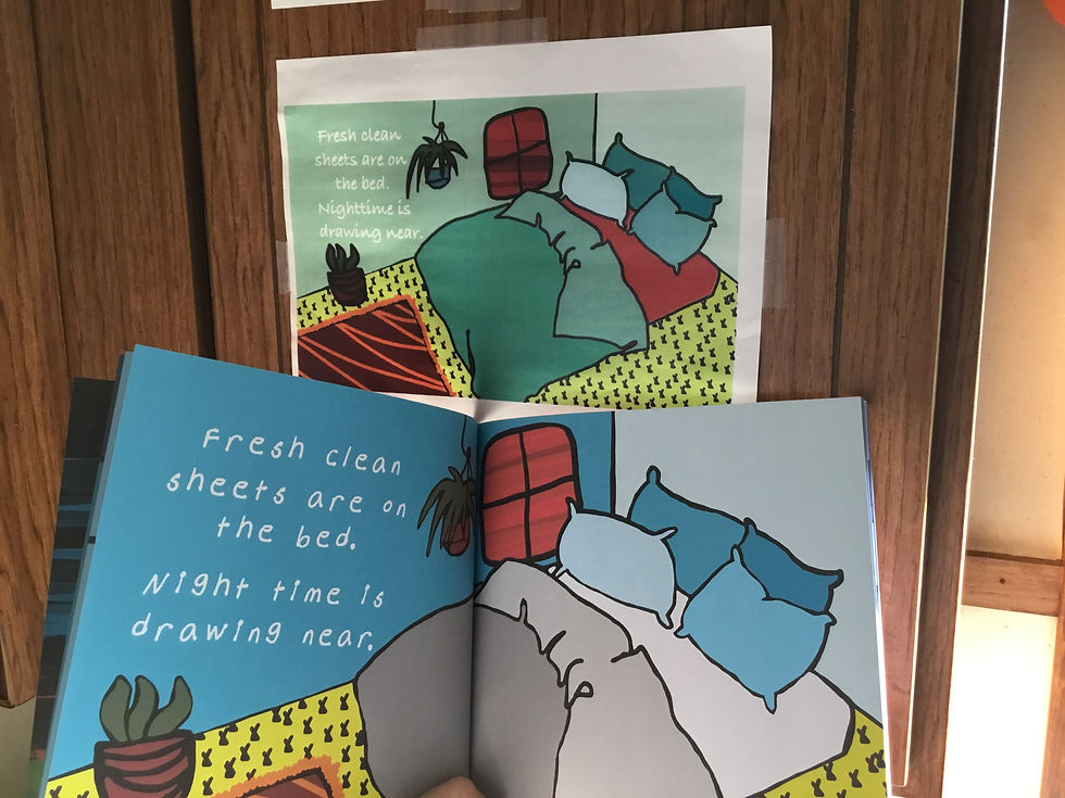
On screen, especially on a high end monitor, the images and colors were beautifully bright, bold, and every nuance of color change could clearly be seen. The teeniest pixel difference made for an intricate image, especially in "The Sky Ahead," where Marybeth works her color magic.
In physical print, however, there is a drastic difference. Color nuances are too close and the effect is lost, rendering the image blander than it appears on screen. A certain...dullness takes over, leaving even the most sure-hearted artist a bit deflated.
The solution was to alter the colors and brighten them slightly, knowing that certain whispers would get lost in translation. Watching the process occur, I couldn't help but have added appreciation for the illustrator's skills as she transformed her work into a version which shone brightly and proudly on the page.
Although editing the colors took additional time, it was certainly worth the added hassle and the quality of workmanship can be seen throughout the books. Seeing the color process unfold before my very eyes was an exciting learning opportunity and allowed us the highest possible quality material.
Thank you for reading, stay tuned for more!
Take care,
Meaghan

Comments